In March of 2019, WeQ approached me about creating a new identity for their new sub-brand, WeQ Studios, a game publishing and development platform. The brief? Create an identity that was playful and vibrant, while still referencing the WeQ parent brand.
First step: Market & user research. Once complete, I presented my findings and ideas to the WeQ marketing team in the form of Moodboards and notes. By looking at what other successful brands are doing in similar fields and collecting the impressions of WeQ staff, I was able to formulate a good idea of what they were looking for and what was needed in their brand.
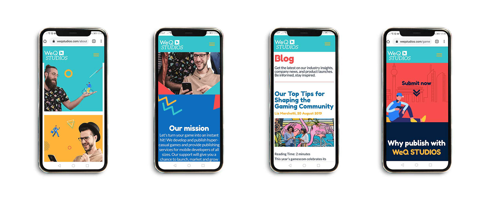
After extensive research and discussion with the WeQ team, I got to work designing and choosing colours, typefaces, graphic elements, illustrations, icons, and photography. My inspiration came from Memphis design and video game shapes, which lend themselves to a fun, dynamic aesthetic.
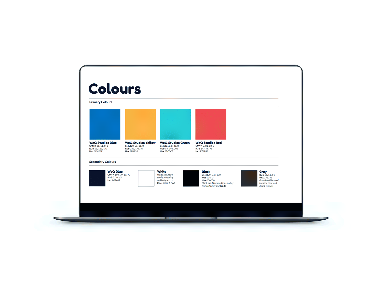
The result? A set of brand guidelines which WeQ use to brief designers who may use the brand in future. Alongside this document, I supplied WeQ with an icon library and set of editable vector illustrations. A local agency was able to take on board these guidelines and assets and apply them to a great new website: https://weqstudios.com/